Tuesday, January 31, 2012

Sharing my Paris finds

I have always had a secret passion for all things zinc. The patina and color palette for my interiors with zinc..are the perfect pair. When we were shopping in  Marche Paul Bert we found this incredible fragment in zinc. It was from an incredible building and was probably early 1800's. The condition was outstanding. I am still contemplating the purchase of this piece. We have a container coming in a couple of weeks. If you are planning a trip to the Paris flea markets soon. I strongly suggest you using Camard as your shipper. They have a booth right in Marche Paul Bert.  You can write one check to them and they will pay all the dealers in the flea markets. That way you have not given money to dealers and wondering if you will ever see your piece. 
These wonderful little chairs were also at Marche Paul Bert. I am taking inspiration from them. I will be making them out of teak and using them as part of our  outdoor seating collection. I will make a settee design from them and larger chairs to go beside a pool or on a loggia. I get inspiration from things and then make them my own. I do love the idea of taking 18th century formal chair designs and making them in teak for outdoor furniture.

I am so excited to show you this piece. We are making it into a headboard design. YUMMMM. This over the top carved gilt is a great focal point to a very simple Scandinavian designed room. Here my cutie pie Gene is making a deal with his poker face. While I am jumping up and down outside of the dealers space, that I must have it.  This is part of our spring collection! 

I can tell you that everything we saw at the Maison et Objet was scrubby reclaimed finishes. Very worn and lots of age. I love this armoire with the scrubby finish and beautiful complimentary blue inside. You can bet you will be seeing this piece in April! If you wanted to buy the original you could plan on dropping $9,000. I love offering this piece for a fraction of the original.

I adore the blue on this sweet French cabinet. The patina and wear was just perfection. We are including this piece in the new spring line as well as the color! I will have it as part of our Parisian paint line as well. A piece like this makes a great server in a room with clean whites and creams and a little taupe. I will love customizing this piece for bathroom vanities too! Stay tuned....... more goodies to share tomorrow. I'm off to prototype land.

Monday, January 30, 2012

Antiquing in Paris

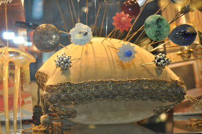
Going to Paris in January guarantees some rainy shopping days. When it does rain we head to the Swiss  Antique Market. There are around 150 antique shops of high end dealers that are in permanent stalls and most are covered. They each have their own specialty. This particular shop had these fabulous Hat pin cushions that are around 10 -12 inches in diameter. I collect vintage Haskell pins and thought it would be fun display them in lieu of having them in my jewelry box. They generally cost around 120 Euros.

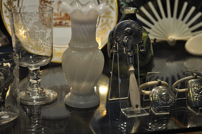
Normally I do have to focus on buying furniture. However, when we are in the midst of so many fabulous oddities I have to stop and at least enjoy looking and asking the dealers questions about their treasures. These were 18th Century baby rattles. I love how they are made from bone and sterling silver. One can be held and turned back and forth to make the rattle. Many of them double as whistles. Gene said, this makes me think of the movie, Nanny McPhee. In this movie, things took place around the turn of the century and they were shown using them. These rattles dated around 1830. The detail and craftsmanship were exquisite. What a great baby gift today!

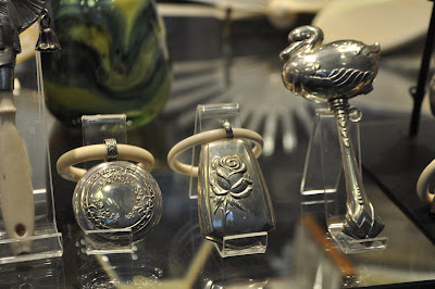
These two rattles on the left would go over the babies wrist or hand to hold and shake.

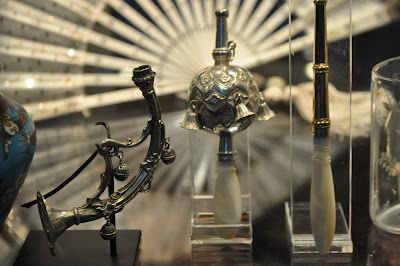
These were my personal favorites. The rattle/whistle on the far left is French and dates to late 1700.


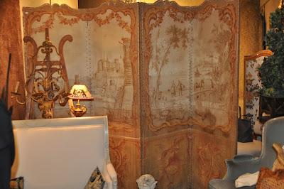
Recreating screens was actually how I got my start in decorative arts. For over 28 years, in decorative painting  career there has been a soft spot in my heart  for painted screens. This one is French and is dated around 1850. The color palette is divine! It was burlap on a wood frame and had gesso under the art. It was around $10,000 dealers price. You could find this piece in a fine antique shop in New York or Atlanta easily for $20,000.
Four panel screens are great hanging above a sofa or as a head board.

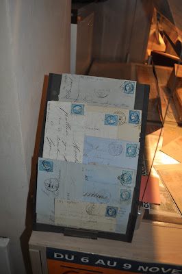
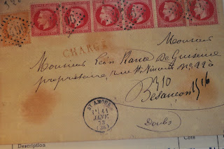
There is a paper market in Paris each week. We decided to visit my friend in the Swiss market place. Here is a grouping of letters from the 1700-1800's. I love the color palette, stamps and typography.

These are some examples of letters that he had that were literally 6-8,000 Euros each! They were rated on the importance of the document, age and especially the stamps.
I love enlarging old stamps and framing them as art! They look especially nice in an acrylic frame. I suggest enlarging 6-8 stamps and hanging them in grouping. You can also enlarge them all on one piece of paper and hanging as one piece of artwork. I would suggest the size of a large movie poster.
Be on the look out for a new introduction of letters framed with wax seals in our spring collection!

Wednesday, January 25, 2012

Paris Markets

As most of you know....we just returned from our trip to Paris late last night. The first few days were spent going to markets and antique shops  around Paris proper. Later on the week, I will share with you the trends for 2012 as we saw them at Maison et Objet. These were images from my favorite market. The Marche  President Wilson. This fantastic market takes place every day from 7-2:30. It is primarily food and flowers. However, the artist in me saw all the colors as a palette for design work. Because Paris is all about their fabulous bread and cheese. I could not leave this image out. It looks as though this has been propped by a stylist.

They would hand make our pasta while we waited.  Any ingredient that we wanted in them... fresh. We always rent an apartment when we go to Paris. That way we can cook, entertain or have room for your children, family or friends  that might be traveling with you. We love using a company called Paris Perfect. They are a lovely couple that live in London and they own several apartments and rent them out for a week or months at a time. Most of them are located by the Eiffel Tower on the West Bank in the 7th district. The neighborhood is very quiet and upscale.

This is Paul. He owns a farm that he makes fabulous foie gras. Gene was officially adopted into his family and was hearing of his entire family history and the nuances of raising ducks and making pate. Paul is one of the reasons why we love markets. You feel like a local and you get to interact with people that love selling  what they make or raise. 

Look at this image and see how you can take this to be a color palette in your next room, painting etc.. The taupe, brown, creams, pale ocher.  I am so inspired at nature and how the colors are complementary. You will see this again in my designs.

The images of the cabbage,lettuces and vegetables  were outstanding. Love the color palette again.

These soaps are hand made from a little guy from the South of France.

Gene and I have decided we could live off of cheese and bread. The stinkier the better. I loved the monochromatic palette of creams and grays in this photo. I plan on using these colors in a new piece of furniture. The trim lines and the art so soft and gradated.
This is our favorite neighborhood restaurant. There is a lovely couple that runs it and is there every night working. They speak very good English. Everything is made fresh daily and is only duck!

They also have a great carry out. So you can have a beautiful Pate and crackers back in your apartment.

Foie gras and pate with toast is a must. So... they have a little toaster at each table....so you can  make your toast just the way you like it.

Their duck cassolet is truly my personal favorite. I have so many beautiful images and furniture pieces to show you! I cannot wait to post tomorrow!

Friday, January 13, 2012

An Old World Kitchen

I have always enjoyed specifying  stone sinks in kitchens. Here is a wonderful example of a white marble double sink in Jean-Loup Daraux home outside of Paris. The book is Demeure and is a must have for any avid antique collector or designer.   I love the detail on the front of the sink and the back splash shape soon becomes the  focal point of the kitchen.
Pin It


Painted cabinets and carrera marble are the perfect combination for an old world kitchen. In our home we did make cabinets and painted them in our Toscana paint. Taupe with Black banding. We added panes on the  door fronts and installed  antique mercury mirror in them.

I prefer the back splashes in solid sheets of carrera, as shown here. Another alternative is white venetian plaster as a back splash.  We have the Italian all natural marmarino plaster at Amy Howardathome.com. You can trowel on white venetian plaster and burnish it to a high sheen. It will look a lot like the carrera marble. As an alternative to the marble counter tops. I enjoy doing antique Parisian zinc. We created a proprietary product that you use on sheet metal. It is an inexpensive way to create great looking counter tops. Have your local sheet metal fabricator scroll the4x8 sheets to fit your counter tops, pop them on with some glue and then antique. You can check out youtube video at Amy Howard at home and there is a video that gives a tutorial on zinc. 

Notice the combination of the stone floor, painted cabinets, white carrera marble tops. I would prefer to use an iron trellis in lieu of the fabric shown in these doors. That would give a more open look. I am headed out to Paris this weekend. So I will not be blogging next week. I would love to have you send me a friends request to Amy Howard on facebook.This is my personal account and will allow me to share my findings with you! 


Thursday, January 12, 2012

Circa restaurant design

I love sharing inspiring interiors with you and telling you how to recreate some element  of them yourselves. This post is about a restaurant that I designed  here in East Memphis.  It was an old space that had sat dormant for years. The neighborhood is upscale and I knew that I wanted to create a restaurant that was not the typical Memphis look. I envisioned it edgy meets country club. On a small budget I went in to design the furniture and the interior space as well as the finishes. This first image is of the foyer. I created a custom venetian plaster that I was a darker value of most of the fabrics. I then came back with pearl mica powders and put them in my wax and waxed the walls to this pearl look. I needed impact of flowers at the foyer. Instead of a large arrangement. I opted for these 15 vases with the same flower. I loved the impact on a budget. It has now become the visual  signature for the restaurant.

This is actually the bar area. The walls are metallic with fabulously dirty  mercury mirror, that we make. I have fun mixing eclectic elements of 18th century intaglios with edgier modern elements.
Here is a better view of the venetian plaster with the mica pearl wax. I love the velvet and industrial edge seating. These were both from P. Kaufman contract. I made the banquets much taller than normal. This gives the intimacy that was needed for larger parties. The bubble light fixture gave us the whimsy that we needed.
If your travels bring you to Memphis. Please go see Chef John Bragg at Circa Restaurant. The food is great and the atmosphere, well..... you'll see.

Wednesday, January 11, 2012

A country estate outside of Paris

In honor of my upcoming trip to Paris next week. I am showing you my favorite Estate in Paris. Notice the awesome Trompe L'oeil wall behind this chest. The campania stone floor with the dressmaker look of these blue silk drapes are so French.

I have actually created walls like this years ago. I would use Benjamen Moore 926 as my base and use an ocher and blue gouache paint glaze over it. The delicate cartouche designs on this little chest are perfect with the shape of the leg.

I could curl up in this room and read right now. I love little tables like this one. They are the perfect for using colors that can have more impact in a room. We actually have a piece like this in the line. I love doing it in Paige blue toscana.

I adore the "grodiness" of the finish on this piece. Let's face it, fabulous old finishes on pieces sell the piece! When I go in an antique shop and find a piece like this. You better believe it is going home with me. Unless it is out of this world expensive. The last chest of drawers I tried to buy like this, was over $24,000. Hence, why I enjoy making painstakingly authentic looking antiques for our clients.

This view of the piece let's you see how beautiful the wear and composition is on this piece. There is a natural oval eye track. Not one area jumps out at you. I love the fact that the wall is a darker complementing value to the chest. It makes it have so much more impact this way. I cannot wait to get to the Flea Markets again. I will share with you what pieces are running like this  in the markets now.

Tuesday, January 10, 2012

Classic Gilded Furniture


I am always drawn to a room with varying textures . Texture, composition, color and great design sets a room apart from an ordinary one. The top of this desk is gilded and hand punched. The white and bole that you see are the layers of the preparation of the wood to receive the gold leaf. After the design was carved it would have been layered with gesso. The gesso is a chalky ground finish to apply the red bole. The red bole is an Armenian clay that is mixed with fish gelatin (to act as a glue)  and applied to the gesso ground. The bole is what is used in water-gilding to have the leaf adhere to the finish. After years of use you will start the see the wear of the gold leaf and these processes are beautifully exposed. What I wanted you to see here was the punching.
The punching on the wood is done with a small round tool and is lightly hammered, making this indentation into the wood. It is painstakingly time consuming. However, you cannot get this look without it. I love how it is the top to a table. You can also do this technique on embossed leather and have a similar effect.
This piece truly is the most spectacular bench I have ever laid eyes on. I am drawn to Scandinavian and Gustavian style benches and painted furniture. However, this piece is spectacular. Animal legs of any kind on pieces are highly collectible, but then to have the addition of the genre scene! The printed velour is in the category of Fortuny; very desirable and is the perfect crowning glory for this piece.  

For my decorative artist friends, I know your heart is stopping on this one. Carolyn Roehm's book "A Passion for Interiors" is a must read. Enjoy

Monday, January 9, 2012

Inspiring Painted Furniture

Everyone knows that I have long been known for my fetish of painted furniture. I have always seen furniture as my canvas. I love the fact that it took a team of  artisans to create an exquisite piece of furniture. Woodcarvers, painters, gilders all working together in harmony to make something that we can use and enjoy everyday.
Last night I treated myself to some "me time".  My own personal Teavana concoction, listening  to Yo Yo Ma with my new Dr. Dre headphones from Christmas and reading Carolyn Roehm's book "A Passion for Interiors" (given to me by the beautiful Jill Cohen).  I study beautiful interiors for inspiration and enjoy dissecting each and every detail that draws me in. Here the fantastic blue color of this console and the bole and gilt accent details, send me!


Notice the detail on the column pedestal. First of all pedestals are really difficult to find. This one is dreamy! The Greek Key detail on the floor is repeated on the column. The base of the column is completely gilded and then the urn and acanthus detail is painted on top of the gold leaf . If you want to replicate something like this, it will be important to use a toscana paint to have a very chalky dead finish to it. Most water based acrylic paints are going to have a sheen to them. I would follow with two waxes to seal your art work. One with an ocher color and the other a darker tint to add color and age.
Artwork that is monochromatic has the greatest impact to me.
I could literally sit and look at this image for hours. The green velvet bench and the complementary blue and gilt finish. The dead grays and blues with perfect wear and age. I really would suggest you get Carolyne's new book. Her taste is impeccable and her home is exquisite. The next time you need a creative escape, if just for a couple of hours, her book is perfect for it.

Wednesday, January 4, 2012

Maison et Objet here we come!

If you ever want to die and go to Heaven in the design world - Maison et  Objet in Paris is it. This is where design, furniture, couture and creativity collide! The international market place of furniture design, fabric design and accessories are all  in one place... 2 times a year.  Here are some images of the upcoming fabric introductions for Maison et Objet 2012.


I simply adore this palette! Be looking for lots of new paints colors and finish colors from the show to start coming into the US by Fall 2012. Everything from wall coverings, fabrics, wall paints, furniture finishes etc. Look at the multiple of uses of multiple sizes of  stripes and one strong pattern. The impact is fantastic.

Today is January 4, 2012 it is also  my 20th wedding anniversary. I am blessed to be married to my best friend and partner in business and in life. Gene is taking me to Paris and Brussels for our anniversary. I promise to take lots of photos from the flea markets and we will take you through the process of how we interpret some of the worlds most beautiful antiques into new furniture designs.